


As a Product Designer at Instagram, I led design efforts for Instagram Reels monetization strategy.
As one the first members of the XFN team, I helped grow and evolve our team structure, charter, process, and roadmap. Collaborating closely with UX Researchers, Product Managers, Data Scientists, Software Engineers, Product Marketing Managers, Content Strategists, other Product Designers, as well as Design and Product leadership, I focused on all consumer-facing ad experiences for the Reels viewer. I partnered closely with Commerce and Shopping teams, as well as the larger Ads org focused on Home, Stories, SMBs, Creators and more.
Throughout my time there, my role evolved. I spent the first few months conceptualizing, strategizing, testing, and executing. As the team grew to four Designers, I focused more on bridging the communication gap between leadership and ICs, collaborating and communicating with relevant teams to expand the Reels ads experience across other surface areas, and worked closely with more junior designers on up-leveling, scaling, and socializing their work.
Our team goals were to increase interactivity, click through rate, revenue, and dwell time for ads on Reels. We aimed to quickly close the (very significant) gap between Instagram’s Home feed and Reels feed as Instagram was pivoting towards a Reels-first and immersive destination.
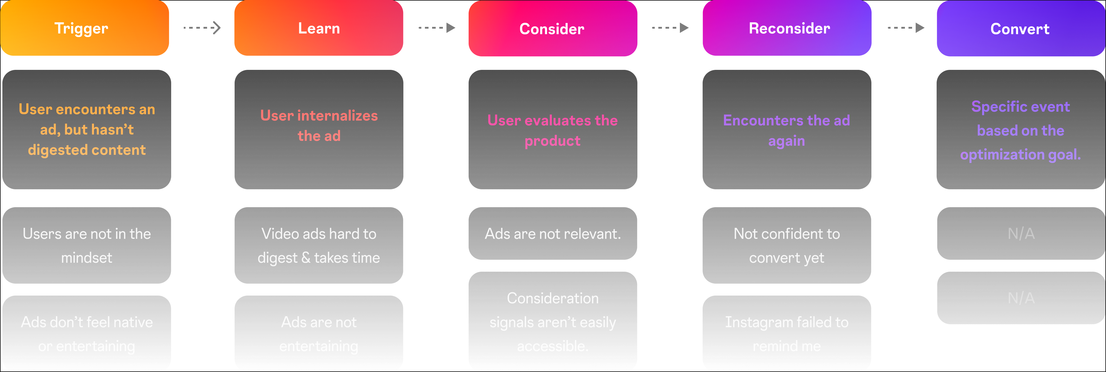
Anchored off the consumer journey framework from above, which I helped develop with my UX Research partner, I developed a series of concepts, directions, and experiments, which could be seen below.
I led and facilitated a design workshop with over 30 people across various functions to develop a design strategy and product roadmap. This series of concepts was what I developed as part of this workshop. Throughout my time there, all the work my team and I explored was anchored off this framework.
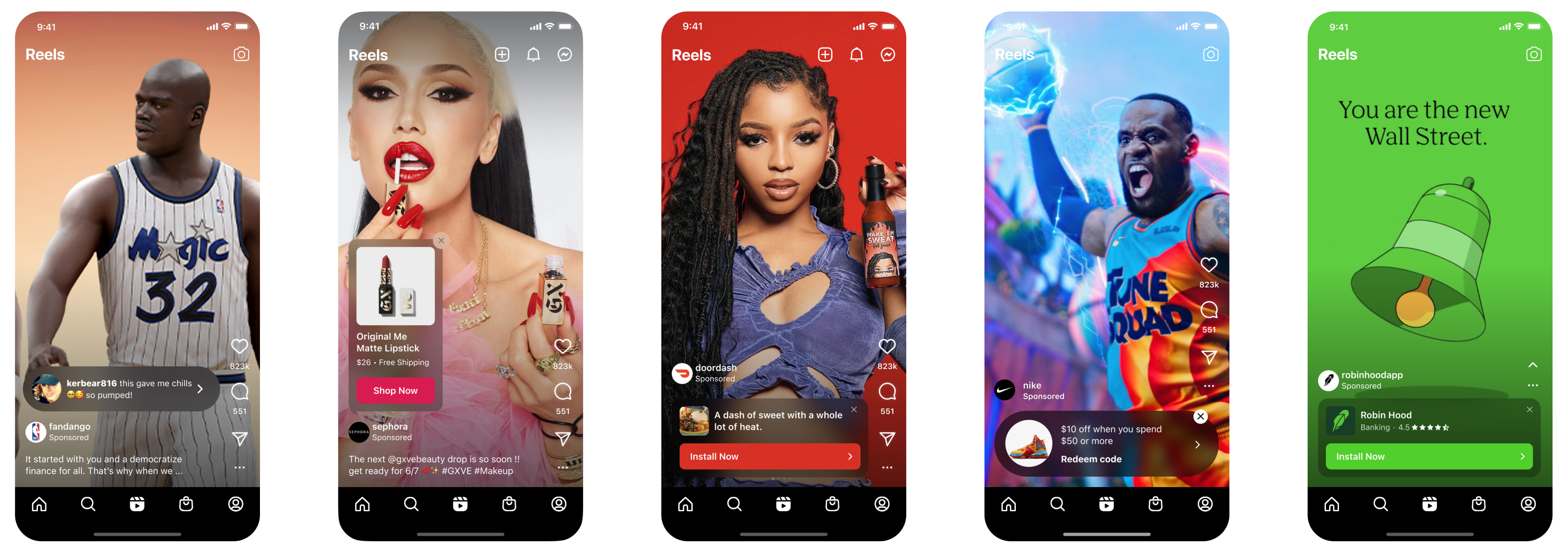
One of the first problems I tackled focused on the high skip-through rate of ads on Reels at the beginning of the video.
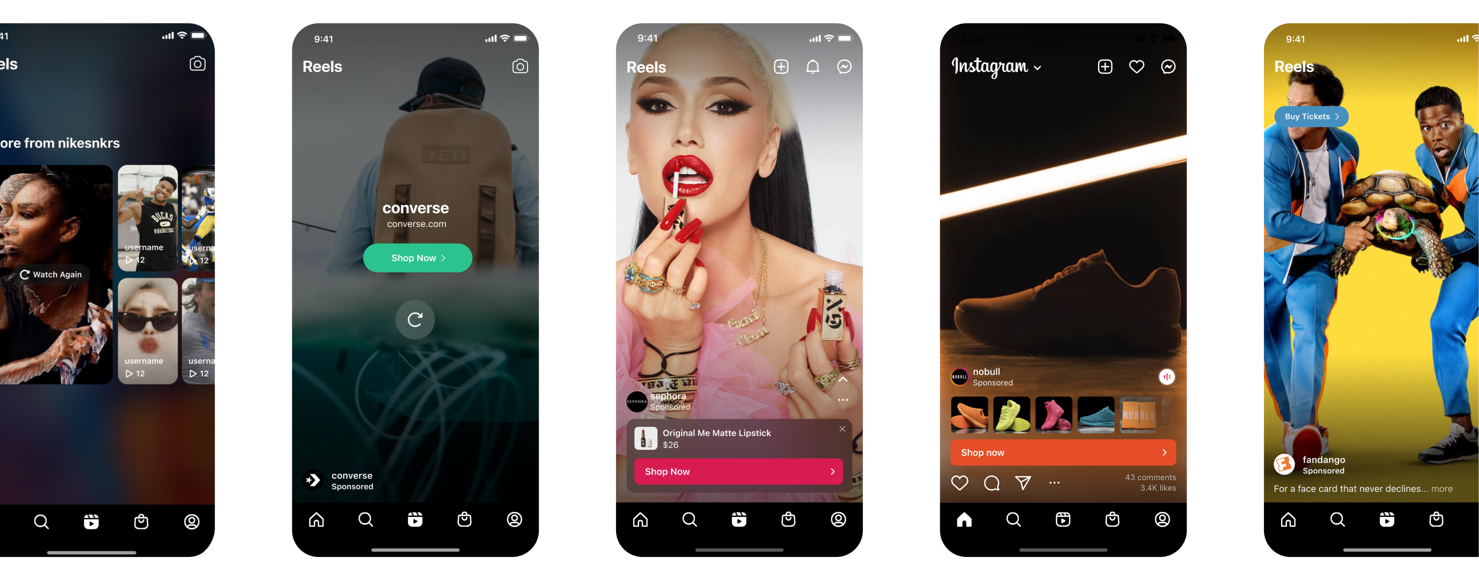
As part of this strategy, I explored foundational design changes for the CTA – things like shape, size, color, introduction of the CTA, animation, and position to improve dwell time, click through rate, digestibility, and more.
We also focused on users who dwelled long enough to internalize the content of the video, but weren't converting at as high of a rate.
One pain point for those users who did dwell, was that video ads could be hard to digest, due to the combination of audio, music, subtitles, product demos, etc. I designed various directions and shipped this new format that revealed a complimentary static image and consideration signals which would make it easier for the user to digest the value prop of the ad and lead to an increase in click-through-rate.
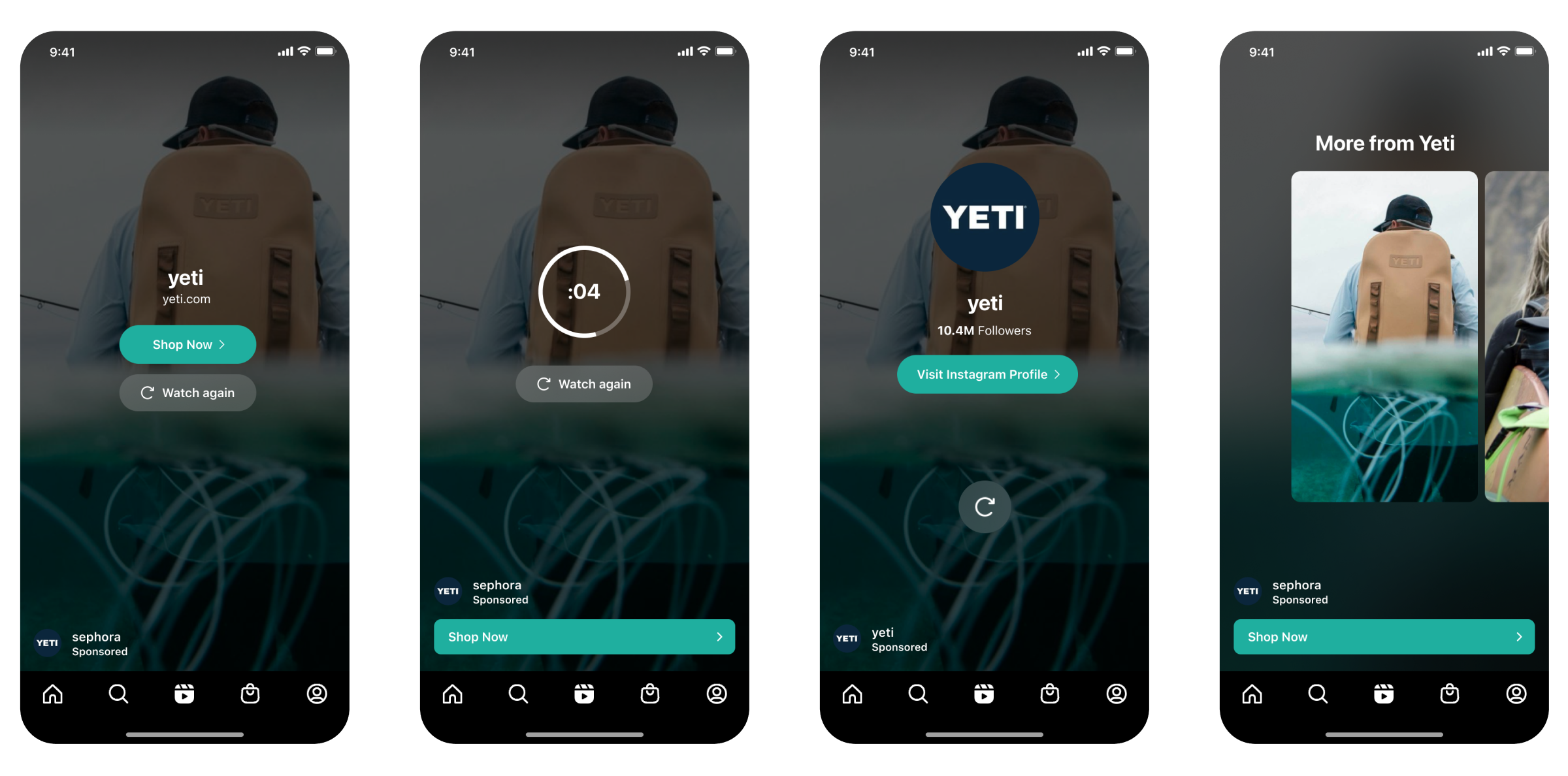
Additionally, I focused on the problems towards the end of the video ad, when the user becomes high intent, evaluates the product, and considers interacting.
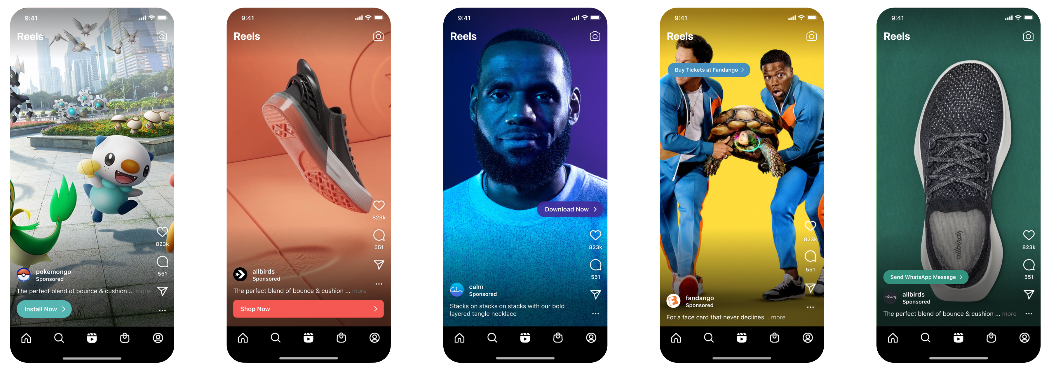
We took learnings from Instagram Stories, where we saw success in adding a focused CTA at the end of an ad, leading to higher conversion. So we took this opportunity and explored various consideration signals plus the opportunity to pause and unwind, with the hypothesis being that it would increase conversion. This did not ship, but team stil felt confident enough in this approach that led us to continue experimenting.